Sophie Tucker singing "Some of These Days" (1926)
The HBO series Boardwalk Empire is striking for many reasons, but I am particularly fascinated by the art and costume direction. Both are absorbed with muted color palettes, mustards, olives, and rusts being the most prominent. Even when pinks and purples are used, they are not rich shades but more washed out pastels. This is not to say that the show is muted or washed out (which would be impossible considering the plot!) or that he color scheme lacks interest. In fact, it is always surprising to see how these modest colors seem so extraordinarily vibrant in the setting. They absolutely jump off the screen!
Georges Barbier (1882-1932) was a painter during the period in which the show is set who often used the same muted palette to similarly astonishing affect. Below I've paired a few scenes from the show with his works to demonstrate the similarities in color schemes. Hope you enjoy!


GET THE LOOK: MARGARET SCHROEDER

This extraordinary character played by Kelly Macdonald shows the most definitive transitions through her wardrobe. Initially reserved and a tad frumpy as a struggling immigrant and abused wife, she becomes far more fashionable and bold in her clothing as she herself becomes more assertive and sees her station in life change. Here's a modern look to capture her transition!
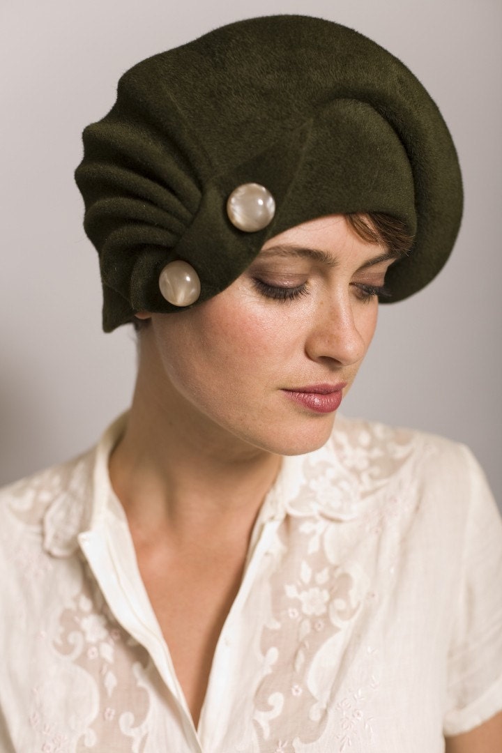
Olive green cloche by Behida Dolic $450
Backless Dolman Tunic by Lisa Rietz $180
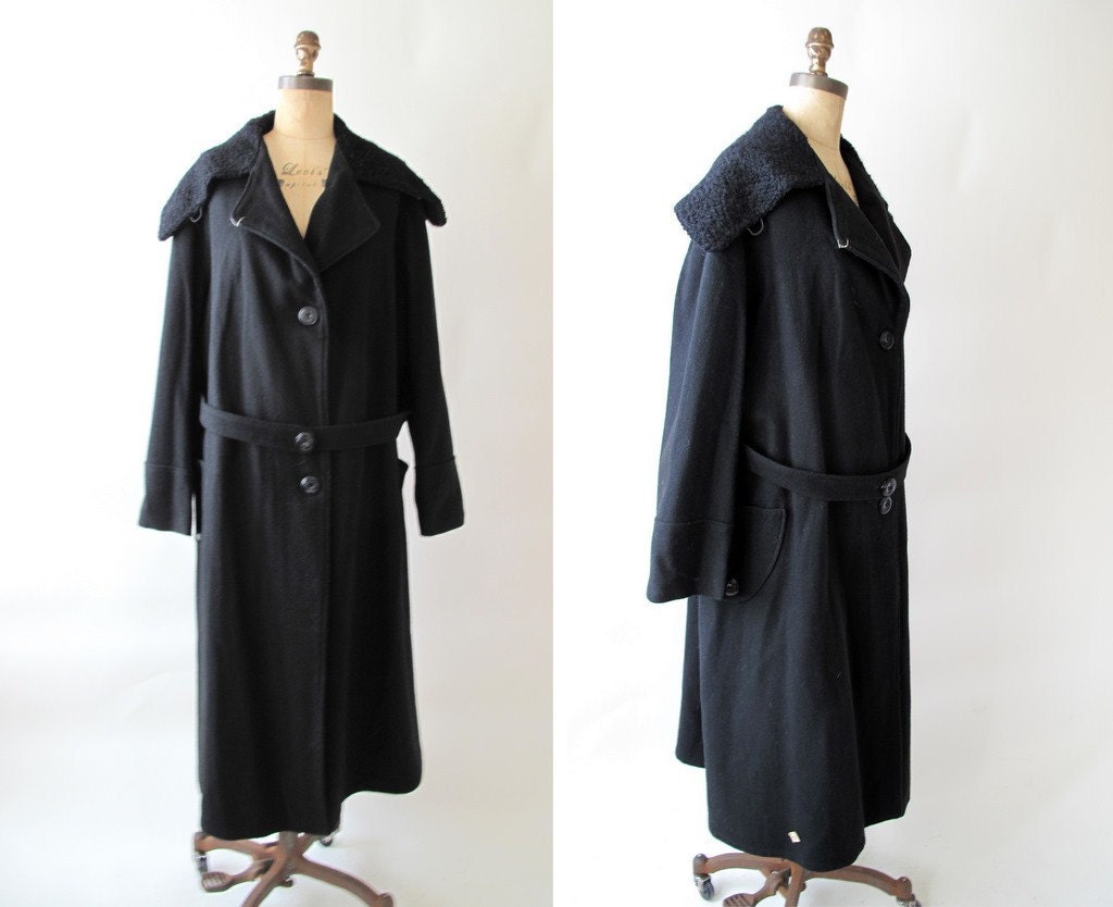
1920s black wool coat with Persian lamb collar from Raleigh Vintage $225
NARS semi-matte lipstick in Jungle Red from Sephora $24


Diggin the Schroeder look.
ReplyDelete